
The Collider:
I love studio logos. After the lights go down and the crowd goes silent, the logo is the first official sign the movie experience is about to begin. I have an especially strong connection with the Paramount logo. Whenever those stars swoop in and encircle the picturesque mountain, I hear the opening theme of The Godfather. I can’t find the video, but those iconic horns sound right as the first star settles in at the side of the mountain. So I am excited that Paramount is celebrating their 100th anniversary by an updating the logo. It is mostly the same, but somehow even more picturesque, if you can imagine that.
The logo will first be seen on the December 16 IMAX release of Mission: Impossible – Ghost Protocol. Hit the jump to see the new logo in full, plus a look at how the logo has evolved over the years.
Paramount Pictures CEO Brian Robbins reveals the studio will pivot from releasing original animated movies in theaters in favor of established IPs.
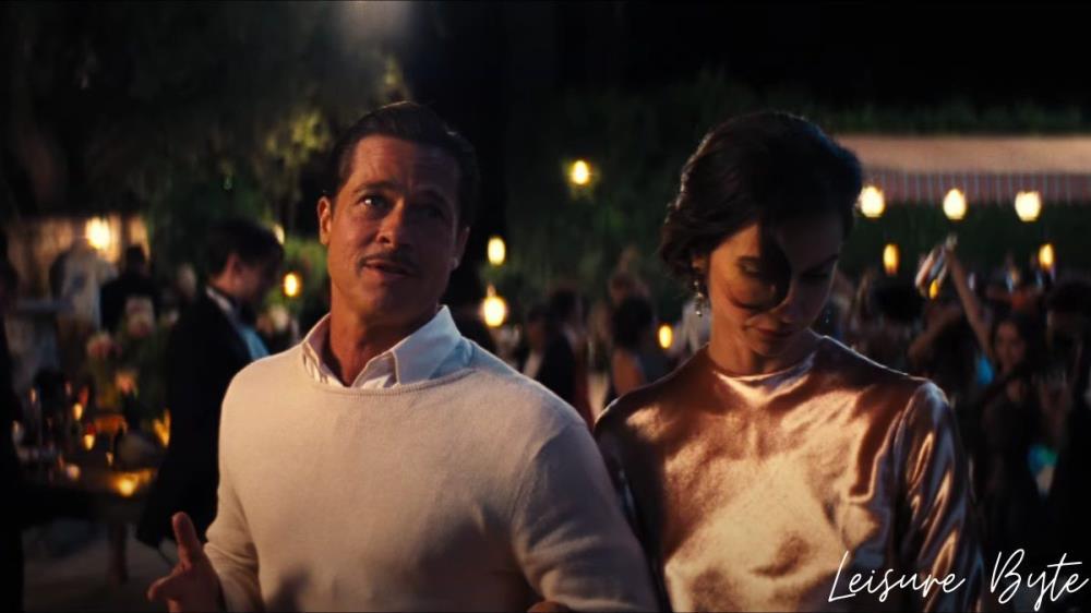
Babylon is an upcoming period comedy starring Brad Pitt, Margot Robbie, and Tobey Maguire. Read more to find out.

Late yesterday, Paramount Pictures dropped the debut trailer for its upcoming psychological horror pic, Smile. Check it out inside!


The changes aren't striking, but they're good.
nice,, happy 100th anniversary to paramount
Noticed this while watching M:I. I like how the color is more classical like the 90's logo, but it's still clear and detailed like the most recent logo!
Yes, it's so interesting how they have changed. You really don't notice until you look at them one at a time like this. It always been one of my favorite logos.